4 Ways to Overcome Imposter Syndrome

 
New Blog Pinterest Graphics (1).png
 

Have you ever been on a phone call with a potential client, and you’re about to lock it down when all of a sudden you hear something in your head go “No way, you can’t do that, you don’t actually know what you’re doing!”? Or maybe you weren’t about to lock it down, but the whole time you couldn’t stop thinking “I don’t belong, I’m not good enough, I don’t have enough experience, I’m not ______ (fill in the blank with the excuse you told yourself here)”.

Ah. Good old imposter syndrome. If you’ve ever tried anything new in your life (literally just about anything), you’ve probably felt it. That feeling of “I don’t belong” or “I’m not good enough because _____” is all-too familiar, especially in the world of business.

What exactly is imposter syndrome?

Imposter syndrome is defined as:

“a collection of feelings of inadequacy that persist despite evident success. 'Imposters' suffer from chronic self-doubt and a sense of intellectual fraudulence that override any feelings of success or external proof of their competence” (Corkindale).

A lot of people who are starting new businesses, especially with this movement of digital nomads and entre- and solopreneurs, and it is not uncommon for them to feel like they are imposters in the industry they are entering. I’ve felt imposter syndrome myself, so I wanted to create a shortlist of four things you can do to overcome imposter syndrome.

4 Ways to Overcome Imposter Syndrome

  1. Say “Yes” - I encourage you to say “yes” to new opportunities, but this does require context. Obviously, you want to say yes to new opportunities that are within reason, your area of interest, and scope of learning. For example, say you are a new Squarespace Web Designer on the hunt for a new opportunity on a freelancing platform, unless you are interested in learning coding languages or have a background in it, you probably aren’t going to accept the job that is entitled “Custom code needed for Wordpress Website.” This project is neither in your area of expertise or interest. Disaster waiting to happen. BUT. Say you come across a project titled “Upload new logo and help with re-designing Squarespace site.” This project has potential - you may not know how to upload a new logo, but you can learn, and you may not know what their re-design requirements are, but it is both in your area of interest and scope of learning. You can always figure out what they want and how to implement it. Take the chance and say “yes” to submitting a proposal and taking the job if you have a consultation and deem it a good fit/doable. 

  2. Acknowledge strengths and play to those - If you know you’re awesome at branding for web design, play to this strength and offer it as part of your service web design service. You then have the confidence in this component of your service, while also taking time to focus and improve upon your areas of opportunity via…

  3. Educating yourself. This is key to breaking from IS, focus on educating yourself whether it’s in your area of expertise specifically or the sales process. By taking the time to educate yourself, you increase your confidence because you have a better understanding of what you’re doing and greater skill level. Does a professor with years of education doubt their understanding of their area of expertise? No. Carry this concept with you and it will help you overcome that fear of inadequacy.

  4. Use your testimonials for a pump up! The people who work with you won’t write a testimonial unless they truly believed in what they said. This is social proof that you’re on the right track! See a theme within your testimonials? Great! Focus on that! Acknowledge “I provide a _____ experience because I’m good at ____” and remind yourself of this in your moments of doubt.

There are so many ways to approach imposter syndrome. But most importantly I want you to know that it’s totally normal, and it will eventually dissipate with time and experience. I was also told once that if you feel imposter syndrome, you probably aren’t the imposter, because the true imposter won’t even know/realize/acknowledge that they are the imposter. Have you tried any of these ideas to tackle imposter syndrome? Or have you tried something different in your life or business?

Squarespace 7.1 Design Backend Guide

 
peonies imac screen and light pink pen and glass of water.png
 

One of the biggest changes that came to Squarespace with the launch of 7.1 was the revamp of the design backend. Squarespace did away with the “Click-and-style” option and instead broke down the design process into different categories. It can be confusing at first - particularly if you’re doing a lot more customizations with colors and fonts, but I promise you it’s actually quite wonderfully simple!

Here’s a breakdown of the design page backend:

Fonts: All selections and customizations of the fonts in your website will be housed here. One of the awesome perks about Squarespace is that if you select a specific font for say, your “Normal” text, it will automatically apply throughout the site. No need to go in and manually change everything. Squarespace does offer font combinations, but there’s also a way to customize everything as will. Just click on the gear button in the top right corner of the font combination box you’ve selected!

Colors: All colors that will be used throughout your site will be updated here. You have several options when selecting your color palette - you can opt to use a color palette made by a designer, use a color palette based on an image, create a color palette based around one color, or design your own palette!

Buttons: The design of your buttons will be done on this page. You can alter the style of button, shape and padding ( how much space is within the button).

Spacing: Alternating the spacing in your webpage width and margins will be done here.

Product Items: If you are adding products to your website, customizations to how the product is displayed on your website will be done here. Everything from photo size, shape, and presentation is updated here.

Image Blocks: There are multiple styles to implement photos on your website, and all customizations for each of those styles is housed under the image blocks page. Depending on the style you choose, you can change text fonts and sizes, how fonts are arranged, photo sizes, spacing, and buttons.

Browser Icon: Also known as a favicon, this is the icon that appears in the tab of your browser. The only action item you take here is to upload a file (ideally a PNG) of your favicon, with dimension no bigger than 300 x 300 px.

Lock Screen: If you have a page of your website that is locked, you can now design that page! This is a totally new feature and I’m super excited about it! You can add your logo, media (video or photo) and change the text that appears instead of having a blank gray lock screen just asking for a password!

Checkout Page: Alter the color scheme of your checkout page so it stays on brand - this is also a new feature that Squarespace has rolled out and I think it will definitely help maintain the authority that product-selling websites want to have.

404 Page: One of the things that helps with SEO is having a custom-made 404 page. Why? Because when you design your own 404 page, it helps keep your audience on your site longer because you can input links that will take them back to different parts on your site. The key is to have people on your website exploring for as long as possible, as it will improve your search ranking as well. For this, you’ll design your 404 page in the “Pages” section, and then you'll be able to select the 404 page from the dropdown list in the “Design” section.

Social Sharing: Place the image that you want to appear when you share your website here. I would recommend something slightly different than your logo. You can design cool graphics on Canva for free.

Custom CSS: Any customizations through CSS will be placed here.

And that’s it! Designing on Squarespace 7.1  isn’t as crazy or overwhelming as you might think. In fact, it’s pretty simple, and it’s awesome how everything is broken down into categories, rather than a free-for-all for you to navigate through!

The 4 Best Features of Squarespace 7.1

 
white coffee cup + iphone + to-do list pad + keyboard.png
 

Squarespace’s launch of 7.1 was one of the most innovative versions of the platform to date. There were a ton of updates and changes made, particularly to the template families (or rather, consolidation of them), and the backend of the design page. This blog post is a bit more opinionated, in that I’m listing my thoughts on the four best features that have been a part of the 7.1 release.

The 4 Best Features of Squarespace 7.1

1. One-Template Family: In previous versions of Squarespace, if you chose one template, you were limited to the design features and functionalities that were associated with that template. Some of these templates are (still) awesome (Brine!) but some templates were a bit more limited in their design capabilities which could be frustrating, and require custom CSS...which could lead to potential hiccups down the line depending on the CSS. In 7.1, all “templates” that you see on the popular page as well as within the website categories listed on the template explore page, all originate from one template family, and they all have the same, extensive, design capabilities. This makes it AWESOME and EASY to navigate and design on because you never have to worry about “can I do ___ on this template?”

squarespace 7.1 design backend layout.png

2. Categorized Design Sections in the Design Backend: I have to say, when I first saw the update on the back end for the design page, I immediately had this thought of “Oh this is..overwhelming” as Squarespace had removed the click-and-edit feature. But. This breakdown is actually extremely helpful because you can take a deeper dive into each category, and they have designer-curated options as well, particularly for font combinations and color palettes. Using the color palettes as an example, you have options to use a designer-curated palette, create one from an image you upload (SUPER COOL!), create one around one color, or customize your own. This is awesome and not only do you see it live on the site immediately, there are so many combinations that Squarespace automatically generates for your color palette for how it appears on the site. 

squarespace 7.1 screenshot of new pages.png

3. Page Categories Now Includes Portfolio Page: There’s a new page in town, and it’s the portfolio page. For any kind of service-based business that needs to have a portfolio page, this is a great new option. Particularly if you are a photographer, you can input a portfolio page, and each “image” (and by image, say you select 1 image of an album as your album cover) within the gallery can lead to another page comprised of photos for that particular album of photos. If you’re a designer, you don’t have to link the photo to another page, you just have a super easy photo-upload process to display your work.


4. Replacing Index Pages with Live Page Add-Ins: Even though Squarespace has removed the index page option, you now have the capability to make every page an index page by simply clicking on the blue and white “+” button. Not only that, you can add a page above or below the current page you’re working on (previously you would have to create the page then drag and drop it to rearrange). Then, when you click on the “+” to add a page, you get a ton of options, broken down by categories with a photo preview of what different options within those categories look like. 

four categories of list layouts squarespace 7.1.png
 

If you haven’t had a chance to play around with the new 7.1 version, I highly recommend getting in there and exploring it. Whether you’re a tenured designer or building your website, the new update has features that will absolutely streamline the design process and offers way more customization options compared to previous versions. Also. No more stress about which template to choose, which is half the battle sometimes. Have you played with the new 7.1 version yet? If so, what are your favorite features?

What You Need to Know about Squarespace 7.1

 
New Blog Pinterest Graphics (2).png
 

In January of 2020 Squarespace officially launched their latest version of the platform, 7.1. This launch was a big deal because a lot of changes have been made - from design capability and functionality to the back-end design experience. I wanted to jump on it and give you some insight on what’s changed if you haven’t had a chance to check it out yet. Here are some of the most notable changes…

Templates

The biggest change we see outside of user interface is the template families - or lack thereof. In previous versions, selecting a template meant that it came from a family that had specific design functionalities, and may have been limited. For example, some templates didn’t have a sidebar option, which would be tough for bloggers and require them to turn to custom CSS or manually building one. In 7.1, although the template exploration page displays a variety of templates based on popular designs and web design categories, they all stem from the same family and all have the same capabilities. Which in my opinion, is AWESOME and a more streamlined experience. No more worries of “does this template have x feature?”

Back-End Interface

  • The site styles navigation bar is different to reflect a breakdown of different design sections for fonts, colors, products, and images rather than all on one page (formerly “Site Styles”).

  • There are now on-screen design changes as well, including insertion points for content blocks, and especially for adding index pages. Rather than clicking on adding a new page in the sidebar, you can now simply click on the “+” button at the bottom of the current page you’re working on, or in between two existing pages.

  • The ability to alternate between mobile and desktop view is now different - Squarespace has removed the tablet view, only giving you the option to view mobile or desktop, and has moved to the top right corner of the screen. The ability to expand the webpage view is also now in the top right corner of the screen.

  • There are a lot more (differently illustrated) page layout options by page type but still a blank page option.

No more

In 7.1, Squarespace has opted to get rid of the following features:

  • Gallery content blocks (now replaced with actual gallery pages or portfolio pages that you can add to an existing page to create an index)

  • Parallax scrolling

  • Cover pages

  • Developer mode

  • Index pages as an option for a new page (you can now manually create them as stated earlier but just clicking on the “+” button)

New Design Capabilities

One of the awesome things that Squarespace has incorporated into 7.1 is a ton of new design capabilities that make the design process easier and more fun. This includes:

  • Premade font combos - but still having the option to customize your fonts

  • Color palette creation - the option to create your own OR use a premade one

  • Removal of the “click & style” process from previous versions, design changes are now based on the item you’re styling...leading me to the next point:

  • Back end styling is broken down into different categories, which is actually quite helpful and intuitive to use (such as fonts, colors, images, products, etc.)

  • You can now edit your site header separately and more intuitively than before 

  • Design lock pages 

  • Design checkout pages

The only caveat is that some content blocks that you could update once before such as the gallery, cannot be adjusted because it is now its own page.

All in all, if you are new to web design - whether you’re designing sites for clients or yourself, 7.1 is a great place to start, and the process is extremely streamlined. Not only that but you have premade font combinations and color palettes, so if the branding design aspect is one that you are or were struggling with, you now have professional recommendations at your fingertips for your website.

If you’re used to the previous versions 7.0 or below, it may take some getting used to, but ultimately I think it’s an innovative change and will make the design process smoother overall.

3 Ways Styled Stock Photos Boost Your Biz

3 Ways Styled Stock Photos Boost Your Biz

Let’s be real - we’ve all come across those websites that have pictures that juuuuust aren’t quite right. Here are three things you create when you incorporate styled stock photos into your business and my favorite resources for to use!

Everything You Need to Work with a Web Designer

 
stack of white and light pink notebooks with pen and two candles.png
 

Congratulations! You’ve officially made the decision to invest in yourself and your business. You’re ready to take things to the next level and that means hiring the perfect web designer to bring your website dreams to life. 

Maybe your initial consultation call went amazing, and all you can think about is how excited you are to get this thing launched and ready to go. And then she hit you with your deliverables and you’re feeling a little overwhelmed with everything you need to prepare to work with her.

Maybe you haven’t had your consultation call yet, but you’ve picked the dreamiest designer and you’re hopping on a call super soon. 

Whatever stage you are in post-decision to hire a web designer, there’s one thing that’s certain, there are going to be things that you need to have ready to work on your project in order to launch your website. While yes, your designer will do the building and design of your website, she can’t do it without fully understanding you, your business and the content that you want on your site.

Here’s a breakdown into two umbrella categories of what you should prepare to work with your web designer:


Umbrella 1: Branding Development 

A lot of web designers include branding within their web design package offers because it makes sense as a 2-in-1 for workflow and design consistency purposes, but this can’t be done without your help. Having an understanding of the branding story you want to tell is crucial to developing a brand (and website) that calls to the audience you’re trying to attract.

To best prepare for the branding questions, I recommend having an idea of:

Your logo: what you want your logo to look like, or references for what you like and dislike

Branding colors: what colors you like/dislike, or if you have a specific color palette already developed that you love - even better!

A mood board: there’s a good chance your web designer will create one for you depending on if you opt for branding in addition to your web design service. But if you don’t, a mood board allows your designer to understand what kind of tone you want your website to set so she can design that . [Check out my Pinterest board HERE for some mood board inspiration!]

A branding board: Similarly to the mood board, your designer may create one for you to display what they’ve designed for you if you decide on a branding service, but if you want to create one yourself, branding boards typically displays the graphic elements you want in your brand design to include:

  1. Main Logo

  2. Alternative Logo

  3. Favicon (the small icon that goes in the corner of your web page tab

  4. Color Palette

  5. 1-3 Fonts (Think Large Header, Secondary Header, Body Text)

  6. Graphic Elements (such as photos of a specific flora/fauna you want/love that goes with your theme), or textures you want to include

    [Check out my Pinterest board HERE for some branding board inspiration!]

Sample Mood Board

Sample Mood Board

 
Sample Branding Board

Sample Branding Board

Reference websites: I highly recommend doing some website research to see what you like and dislike in a website layout and design. A list of 3-5 sites listing elements/functions that you like and dislike will give your designer a better idea of what you’re looking for in a website, thus making it easier for them to create your dream site. [Check out my Pinterest board of Squarespace website layouts and designs HERE if you need some inspiration!]


Umbrella 2: Website Content

Copy: This is the text that you want on your website - from your bio, to text on your home page, to call-to-actions (also known as CTA’s). If you’re finding that you have a hard time writing, you can also hire a copywriter to do the work for you!

List of Services/Products + Descriptions + Pricing: This item is similar to copy but I’ve found that sometimes this very important list is often forgotten about. If you are selling services or products - particularly products in this case - it’s important to list product names, descriptions, pricing, and how much you have in stock (whether it’s a limited number or unlimited), so they can display correct product information on your site, and ensure you don’t oversell anything you might have a limited stock of!

Photos: All pictures that you want on your website! I would also recommend making a note if you want certain photos at specific locations of your web pages as well.

Links: If your website is going to link anywhere within or out, noting where all CTA’s go, and any links to external pages will be important to include in your folder of items for your web designer and make their job easier!

Social Media Connections + Logins: Pretty simple - if you want any of your social media accounts connected to your website, you’ll need to provide the login information for them to your web designer. You don’t have to do this if you prefer to do it yourself, but if you are having a web designer do it, you may need to be involved for few minutes as a lot of social media sites now have two-factor authentication where they send you an email/text verifying that it is you connecting your account to your website.


So that’s it! Hopefully any anxiety about knowing what you need to prepare for your web designer is gone and you can get to compiling all the content to bring your website to life!

5 Reasons to Invest in a New Website Design

 
small peach-colored chrysanthamums + white apple mouse + white keyboard + peach colored notebook.png
 

Change is inevitable in life - just in the same we as humans grow and evolve, so do our businesses. Change is good - particularly in business because it usually means you’re growing, you’re realizing more about who you want to serve, and you’ve (hopefully) refined your craft to better serve your audience. With the growth and evolution of your business, you might be finding that the website you once so loved, just isn’t cutting it anymore. Whether it’s not you, on brand, or reflective of who you’re catering to, it might be time to invest in a new website design. 

If you’re finding yourself in this awkward position (think of it as a success problem - and those are the best kinds to have), consider these five reasons to invest in a new website design, and jump on the train so you can continue bringing in those dream clients of yours.

  1. Your branding has evolved

    Those colors, graphics and logo not quite “on brand” anymore? Maybe you’ve realized that pink and marble just aren’t you or your biz anymore, and you’re looking for something a little bit more modern, simplistic and chic. Suddenly you’ve found yourself drawn to light blues and blacks, and that’s totally okay. If you’re finding that your branding isn’t on par with who and what you serve - or even what you like anymore - consider re-doing a mood board or branding board, or hiring a graphic designer to help you revamp your brand to ooze that vibe you’re on the level of. Web designers typically also include a branding service within their web design service (including yours truly), because a strong, consistent brand is crucial in developing a site that converts, translating to more clients and money for you.

  2. Updating your Products and Services

    This is an easy one. If your current website doesn’t display your current services, or displays old, outdated services and pricing, you’re not going to attract the clients you’re looking for. You might actually attract the wrong clients, because what they’re looking for, isn’t what you do anymore. Whether you have outdated or new services, updating your website to reflect this change is crucial to running an efficient business and maintaining your authority in the service that you offer. If you came across a website with a service you got excited for, finally got in contact with the provider, just to hear that they don’t actually offer that service anymore, how would you feel? You want to make sure you’re creating an online experience smoother than butter for your online visitor. The more seamless, intuitive and informative the experience, the better they understand you and what to expect from you.

  3. The current vibe of your website isn’t matching who you want to bring in

    This statement is similar to the topic of your evolved brand, but I’d really consider it it’s own topic of discussion. The truth is if you’ve outgrown your branding - that also likely means that your IC (ideal client) has more than likely changed, and now you must cater to your new ICA. If your website isn’t on brand, it will be harder to attract the clients you’ve been dreaming of working with. Giving your website a refresh may also show someone who has been following you, that you’re taking the quality of your website seriously. What do I mean by that? If I follow someone who seems awesome to work with, but their website is “blah,” I’m feeling less inclined to work with them in that moment. Because if their site isn’t quite a match with me, I’m going to wonder if they will be a good fit to work with. Now. Say I continue to follow said person, and suddenly they revamp their website and it’s not just beautiful, but so me, the likelihood of me working with them has skyrocketed because the revamped site emanates the vibe I feel. It sounds weird, but I can’t be the only person who thinks this way...right?

  4. You saw a template/layout that you’re absolutely in love with and must have it because it’s perfect

    Perhaps you’ve started your search for a new, modern layout for your website, when you come across that layout. That layout that you can’t get out of your head and you’re realizing is the epitome of you, your brand and your biz. “This would be perfect for what I need …. it’s ____, ____, and ____.” Girl if you find something that calls out to you and your business - implement it. The more you love your site, the more excited you’ll be to share it, and that positive energy is going to attract the right person to your website. 

  5. You don’t have time to make all the updates yourself

    Here’s the kicker. This list is called “5 Reasons to Invest in a New Website Design,” but I haven’t really touched on the investment part, and that’s where this last point stands out. As your business grows, you’ll be too busy working with clients to re-do your branding, let alone revamp the entire website. Hire someone else to do it for efficiency purposes, so you can keep making that money and growing your biz. Because here’s the thing - sometimes when we are “revamp” something of our own, or try to do something creative for ourselves or business, it’s hard to decide on something because there’s so many options. We like what we like and there’s so much stuff we like. Next thing you know, we become overwhelmed with options and become stuck because we can’t decide what to do. Hiring an extra set of eyes for your brand and your website can be a breath of fresh air, and give you x number of options to choose from, all while you have the ability to tweak it as you like until it’s yours.

That’s it! If you were thinking about investing in a new website design, you now have five reasons backing up and validating your feelings. What are you waiting for?! Invest in your new site and keep growing and sharing your passion.

Create Multiple Bit.ly Links for One URL

TAC Blog Thumbnails.png

Have you ever needed to create multiple links for one URL, and instead find yourself tearing your hair out for three days because you can’t figure it out?

Maybe you need multiple links for guest speakers on your wellness summit, and they each need a custom link to send to their audience. Or maybe you have a few brand ambassadors you need to give custom links to track how much traffic each ambassador is driving for commission purposes. The beauty of bit.ly is that it offers so many functions and flexibilities - if you haven’t already implemented it into your biz, now is the time!

What makes bit.ly so awesome? 

I personally love using bit.ly because in addition to making a link short, sweet, and (most importantly!) customized, you’re also able to see how many clicks the link is getting. Aka how many people are going exactly where you want them to be. This is particularly helpful if you’re trying to see how many people are going to your sales pages or any other page you are trying to promote on your website. Not getting enough clicks? Promote more. Simple as that! Although it’s an extra step, I also prefer to add bit.ly links to my linkt.ree * account because then I can track how many people are clicking the links I have in my Instagram bio, since that is my main marketing/advertising platform.

Perks of using Bit.ly:

-Shorten links if you have limited character counts in description boxes

-Customize links to make them more personal

-Track how many clicks your links are getting

How to create a basic bit.ly link:

  1. Set up a free Bit.ly account (if you’ve already got one, you’re ahead of the game)

  2. Once you see your dashboard, click on the orange “Create” button and you’ll see a small sidebar enter in from the right.

  3. You can copy-paste or manually type in your URL and click “Create”

  4. Create a title and add a custom slug.* Don’t worry, just click the “Customize Back-Half” box and bit.ly will just put whatever you type after the “bit.ly/”

  5. Click “Copy” and paste the new Bit.ly link to its final destination!

*Slug = what comes after the “ / ”  after “bit.ly”. And creating a custom slug will lead to a higher chance of viewers clicking on it because they know where they’re being taken to - I mean would you rather click “bit.ly/3dsXw8” or “bit.ly/dailyyoga”? 

Why would you need to create multiple bit.ly links?

  • To have customized links for guest speakers for commission purposes

  • To have customized links for ambassadors to see how much exposure they are giving the link

  • To have customized links for your each of your platforms to track which platform is bringing the most traffic to your designated pages

Here’s how to create multiple bit.ly links for one URL:

  1. Set up your free Bit.ly account

  2. Once you see your dashboard, click on the orange “Create” button

  3. Manually type in your URL and then add “/#01” for your first link

  4. Add your title and customized back-half (I recommend using names of people if they are customized for individuals, or locations if you want to track clicks from Facebook, Instagram, etc.).

  5. For the remaining links, simply change the “/#01” to “/#02”, “/#03” etc. until you get to the total number of links desired.

That wasn’t too bad right? Now that you know about the amazing benefits of bit.ly, and how to create multiple bit.ly links for one URL, you now have a new way to track traffic to your pages!


↓ Video Guide Below ↓


*There are no affiliate links in this blog post, just my honest recommendations!

No Sidebar? No Problem!

How to create a sidebar for your blog on squarespace

Imagine: You’ve selected the template for your dream site. You happen to be a blogger and cannot wait to get all of your amazing pieces out there for the world to see. You’re 20 blog posts deep into your site when you realize you haven’t set up your sidebar yet and you think, sidebar is exactly what I need so everyone can see other blog posts, quick info about me, and my Instagram page. You go into settings and *horrified* find that your template has no sidebar on its blog function. What the heck are you supposed to do now?!

I’m here to tell you to take that panic and throw it to the side because honey, there is a solution (one that doesn’t compromise your template either!)

But first, here’s some helpful information, a list of all template families on Squarespace that include the sidebar function for the blog pages

Squarespace Templates (& families!) with Side Bars on Blog Pages

  1. Avenue

  2. Bedford

  3. Five (& all pages)

  4. Forte

  5. Galapagos

  6. Ishimoto

  7. Montauk

  8. Skye

  9. Wells (& all pages)

  10. Wexley

Whew, now that that’s out of the way, did you see your template or template family up there? If not, like I said, not to worry, I’ve got the solution below! I had a client who transferred her site from Wordpress to Squarespace, and the template we agreed on actually didn’t have a sidebar option for her blog...and she’s a blogger. (Psst…Check her blog out here for some awesome beauty and lifestyle info!)


Luckily, she trusted me to come up with a solution so I did what anyone would do...consulted Squarespace for their help (it’s 100% awesome and free by the way) and I discovered you could actually make a sidebar. So I did, and if I do say so myself, I think it turned out fabulously. Here’s what the final product ended up looking like:

 
Sidebar Final Product Lifestyle of Leslie.png
 

Not too shabby right? I created a few graphics for her, and she had some from her previous site that she wanted implemented and voila! You’d never guess that her site template didn’t have a sidebar feature because it’s on every page.

Alright, so now that you know it’s possible to create a sidebar on your Squarespace site, the last key question we need to ask is, what exactly am I going to put on it?!

Here’s what we did for Leslie:

  • Graphics (from her, and designed by yours truly)

  • A brief welcome to her blog and what her goal of having the blog was for

  • Email Subscription to her awesome newsletter

  • A “Get In Touch” button (actually a graphic!)

  • Her Instagram (she opted for 8 of the latest posts)

  • Recent Blog Posts

By no means do you need to include all of these components on your sidebar, but I’d say they’re pretty standard and have a great way of keeping your visitor engaged on your site and wanting to see more!

How to Create a Sidebar for a Squarespace Template Without One

OKAY. It’s time to get cracking, here’s a step-by-step on how to create a sidebar on your blog post!

Step 1: On your Home Page, go to “Pages”

Step 2: Select “Blog” (if you don’t already have it, click on the “+” button by “Primary Navigation” and click “Blog Page”

Step 3: Hover over your blog post (if you don’t have a blog post yet, click “+” by the gear symbol next to “Blog”

Step 4: You’ll see a blank page, this is where we set up your clean slate. Click to add 4 Spacer blocks and arrange them so that you have two with the smallest spacing on each side. With the two spacer blocks in the middle, arrange it so that one is large enough to be the centerpiece (your main blog content will go below here), and another that is generally about the size of two of the smaller spacer blocks (your sidebar will go here)

Step 5: Add your blog content under the “Centerpiece” spacer block.

Step 6: After determining what fabulous pieces of you and your website that you want to display in your sidebar, it’s time to implement! Simply add content boxes accordingly under the “Sidebar” spacer block until the sidebar you’ve been envisioning comes to life! Take this as an opportunity to be creative - use graphics you’ve designed or had designed for you, your favorite photos, link your Instagram, show other blog posts that need love, are crazy popular, or a combination of both. This sidebar is all you.

 
new sidebar on squarespace template without sidebar .png
 

Squarespace SEO 101

SEO 101 Blog Cover.jpg

1: Select your site type and update the website description. This should be 1-2 sentences about your site and include basic information such as your site title, your name, and what you do.

2 : Set titles on EVERY page. On every page you create, you will have the option to input a navigation title, page title and page description. Here’s what those things are:

  • Navigation Title: Shows up on the menu bar of your site (usually in the header/footer)

  • Page Title: Add more details in this description as this is what is pulled when search engines crawl your site for matching keywords

  • Description Box: This is optional as some templates display what you write and others do not. You don’t necessarily need to fill this out if you don’t want your description showing up on your site, but if it doesn’t show up on your site a little more description of your site won’t hurt when the search engines go a-lookin’.

SEO 101 Basics.png


3 : Set up your SEO Backend. Updating the SEO backend will provide search engines with the necessary information to pull keywords from your site that match the keyword search done by potential clients and site visitors!

  • From the Home page, head to Marketing > SEO

    • Fill out the Site Title and Site Meta Description fields - this is CRUCIAL to do. This step tells the search engines the name of your site, and when search engines scan site information for keywords being searched, what pops into your site description is what will pop up in the preview if it’s a great match to the keyword search.

      • You’ll be able to see how this shows on a search engine result page such as Google in the “Search Results Preview” box right below the data input boxes

      • You can further adjust how your site information displays by selecting “Advanced” to adjust how your site appears on search engine results as far as “Page Title - Site Title” or vice versa, however I recommend keeping it as is.

SEO 101 SEO Back End.png


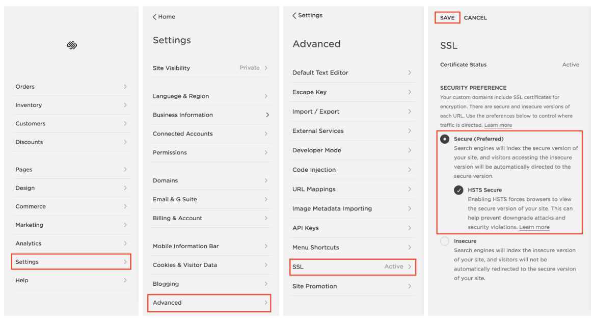
4 : Secure Your Site. Search engines LOVE secure sites, so locking down the SSL is crucial in boosting your search result rankings. SSL stands for Secure Sockets Layer, and basically it ensures that the connection between your browser and the site is secure. So not only is it important to update the security of your site for rankings sake - you provide your site visitors with peace of mind that your site is safe and authentic.

  1. From the Home page head to Settings > Advanced > SSL (you might have to scroll down to see “Advanced” pop up)

  2. Under “Security Preferences” make sure Secure (Preferred) is selected, and then click the button to check HSTS Secure as well

  3. Click “Save”

SEO 101 Secure Your Site Instructions

5 : Optimize Images for SEO. When search engine scan through sites, they essentially “read” through everything - except when it comes to pictures. However, you can allow them to “read” your picture by including the appropriate file names and captions on the photos you upload to your website. This way, search engine can “read” your image file name/title, pull it and allow your site to show up higher on the search results if the keywords match.

Here are the 2 steps to optimize your images:

  1. Name the image file when you save the file, BEFORE you upload it to your website. So instead of uploading the image file “img123” it might say “3 Nights in Marrakech Blog Post” (say if you were a travel blogger). This is way more detailed and will allow for better ranking results for your site if someone were to Google “3 Nights in Marrakech.”

  2. Fill out the “File Name - Optional” Box. You can use the same description as your detailed file name, but I would also recommend including your name and your site name (or blog name in this instance). If you’re utilizing Pinterest, it will also allow it to show up on Pinterest as well. This file name what Google is primarily looking at and part of how it selects the order in which sites show on the results page. Make sure to hit Apply at the end!

SEO 101 Optimize Images

BONUS: Clean Up Your “Not Linked” Section

    1. Disable pages you want to keep but aren’t using - this ensures the search engine doesn’t find it in its scan

    2. Delete pages you won’t need again to create less clutter and a more organized back end for you and the search engine

    3. Add a password to pages that are private you don’t want search engines to crawl through

How to Compress Photos for a Faster Website

Compress Photos to Speed Up Website.jpg

Site a little on the slow end? It could be because your photo size files are too big. The best practice when it comes to photo size on Squarespace is to be a JPEG image that is no more than 500KB in size. Images larger than that can impact the speed of your site and cause site visitors to renege and leave the site before they even see what you offer!

Here’s a quick tutorial on how to compress your photo files if they are greater than 500KB

  • Head to https://www.jpegmini.com/

  • Download the app from the site onto your computer [it will show up as an app]

  • Determine how often you will need this tool -

  • If you are compressing less than 200 photos, I recommend using the trial.

  • If you will be compressing more than 200 photos (say you’re a web designer or photographer), I would recommend purchasing the app to for $89 USD per year giving you unlimited uses.

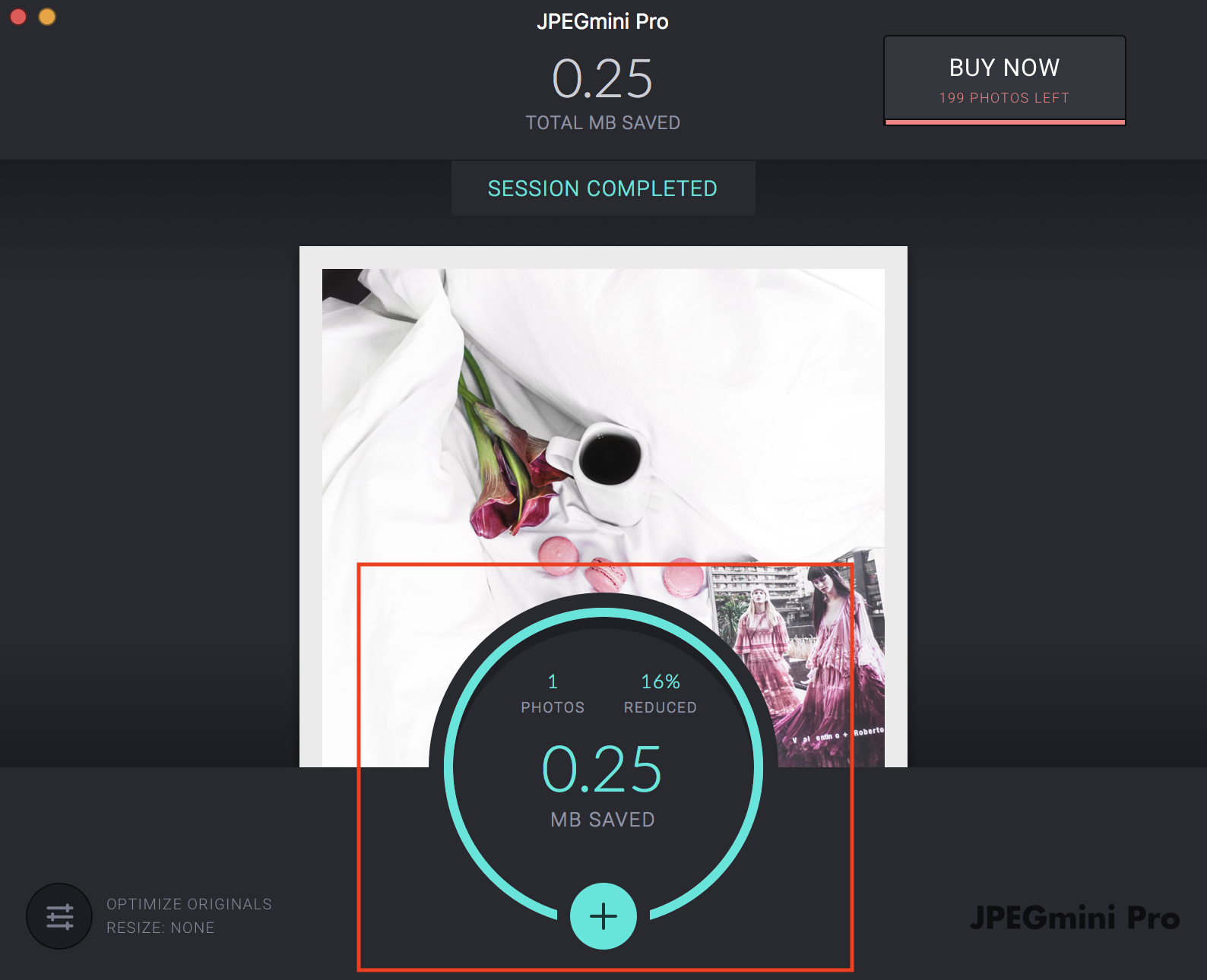
  • Upload the file(s) you’d like to have compressed by clicking the teal circle with a “+” in it

 
jpegmini add photo to compress.png
 

  • And Compresso! It will automatically compress your photos and save them as the smaller file size, and you can also see how much file space you saved as well:

 
jpeg mini saved space.png
 

  • Upload your new photo to your website!

Remember!

  • Make sure you you have an appropriate filename before uploading the photo to your site per the SEO 101 [link] cheat sheet

  • Megabytes (MB) are larger file sizes than Kilobytes (KB) so you will more than likely be compressing MB files.

For the math impaired (me too, don’t worry!): A kilobyte is 1024 bytes and a megabyte is 1024 kilobytes

Is Squarespace Right for My Business?

Is Squarespace Right for My Biz Blog Cover.jpg

You’ve got your business idea and plan all ready to go, and now it’s time to create the website of your dreams - one that will convey who you are, what your business does, and allow your users to fall in love with you before they even have a chance to say hello! But what website platform do you choose? With so many options out there, it can be tough to decide which platform is the best fit for you and your business.

So how do you decide if Squarespace is “the one” for you?

To be honest, there are a ton of factors you could consider when trying to decide which platform is going to be right for you and your biz, but I want to focus on two things: your time and your content.

Time - Your time is valuable. As a business owner, your priority when you’re first starting out is to make sure that you can devote as much time and effort needed to developing your business, brand, and services. You don’t want to spend a ton of time trying to find and implement plugins and building your website. At this point in time you might not have the money to export the work to hire a web designer and you need to do it yourself.

This is where Squarespace REALLY exceeds as a platform in my opinion - building a website on Squarespace is intuitive and they include so many of the key things that will help optimize your site. Features like SEO, security, and premium features like pop-ups and announcement bars (which might be plugins on say, a Wordpress site) are already included. Not to mention if you ever have This makes it super easy and time-efficient for you to create and maintain a site if you’re a one person show at the moment. It’s as simple as selecting the plan that works best for you and includes the features you need, and implementing them. There’s no worry about finding plugins and trying to download and implement them onto your site, everything you need to run a fantastic website is there. Now, should you decide you’d like to have features that aren’t offered by Squarespace, there is the Custom CSS box where you can implement coding to add something that Squarespace currently doesn’t have (e.g. if you want to use Calendly as your method of booking clients instead of their partner, Acuity Scheduling).

Simply put: It takes significantly less time trying to figure out how to use Squarespace and maintain your site than with Wordpress and if time is not on your side (or you aren’t necessarily tech-savvy), Squarespace is the best platform for you.

Your Content - When you’re building your site, it’s important to know exactly how much content you have and have an understanding for your vision as to how much content you may eventually have as well. For example, if you currently don’t have a ton of content, simply need a 4-5 page website that conveys your services and maybe a few digital products, Squarespace is 100% the platform for you. However, if the site you’re building needs to have a TON of content such as an extensive resource library, a variety of options, opt-ins, blog, and information about you and your service(s), WordPress may be a better option.

This is not to say that Squarespace can’t handle a ton of content or doesn’t have a ton of options for customization, but by the time you’re developing that much content or have that much information and tools you’re providing your clientele and users, you probably have a team who is running the back end. In this case, you can hire WordPress wizards to handle everything for you since you’re no longer a one-woman (or man) show and are free to focus on content exclusively. Squarespace is the better option when you don’t have a ton of time or too much content you’re trying to manage, but as you grow, you will have more options for customization and content management with Wordpress, and likely the money to hire someone to help you as well.

BONUS: 2 Features Offered by Squarespace That Will Make Your Web Design Journey Easier

SSL Security - All sites include SSL Security, which is crucial when it comes to Google ranking your site and user peace of mind. As of July 2018, Google implemented a protocol that basically said if your site wasn’t SSL Secure, it would be heavily impact your search results rankings. Squarespace automatically updated its platform to include this as an option, and the only things Squarespace users had to do was *literally* click a checkbox and their sight was secure. Wordpress users on the other hand? Not so easy. See part of the service that you’re paying for with Squarespace is that they make sure to update their extremely inclusive platform to ensure the back end (security, SEO, etc.) is as up-to-date and easy to use for you. Wordpress is much more manual in their approach and at the time this change was taking place, web designers were swamped trying to help site owners convert their security measures. Why was it such a big deal? Ensuring all the sights meant that EVERY link had to be secure, so if a blogger had tons of links, can you imagine the tediousness of having to go through each link to make sure it was secure and didn’t break? #GoSquarespace

SEO Optimization - Another huge difference between Wordpress and Squarespace is that the Squarespace platform is already optimized for SEO. It’s as simple as filling in the boxes and you’re good to go (on a basic level - of course there are more ways to improve your SEO but these are the basics when you are building your site). Wordpress on SEO is a much different story: you have to search for and download an SEO plugin (with tons to choose from) before adding your titles, tags, descriptions, etc. to optimize your site. #aintnobodygottimeforthat

Customer Service - You may not think customer service is important until it’s 4am, you’ve been up all night trying to work on your site and you’re about to pull out the last of your hair trying to figure out why something doesn’t work. You’ve googled questions, checked out forums and still can’t figure it out. Cue Squarespace CS. You send them a quick message on the live chat (because it’s 4am and they’re awake too), and in 10 minutes you’ve figured out the problem that you’ve spent the last hour on. The WordPress user on the other hand? Same problem, 4 hours later and no solution. Okay okay it sounds like a dramatic commercial at this point with a Morgan Freeman-esque voice-over but SERIOUSLY, Squarespace has AMAZING customer service. I have no shame in admitting I’ve reached out to them for help numerous times, and they are always quick to respond, extremely knowledgeable, and courteous. What more could you ask for? Squarespace offers two methods of contact - they have a live chat during the day, starting as early as 4am EST and closing at 8pm EST, and if live chat is closed, they have 24/7 email services as well. I have neither seen nor experienced this option with Wordpress, at least not to the degree of ease that Squarespace has. #winwinwin

Fun Fact: A massive difference between Squarespace and Wordpress is that there is a team in New York who works for Squarespace to ensure the platform’s back end stays with the times and keeps platform features up-to-date(such as SSL for security and SEO optimization). Wordpress doesn’t have a consolidated team like this, and it’s pretty much a free for all if you’re using if you’re using WP. This is also where Squarespace’s amazing customer service

So there you go! Long-story short, if your biz doesn’t have crazy volumes of content and you need a site that is intuitive to use, easy to maintain and fully equiped with the assistance and features you may need, Squarespace is the site for you. Time to build your website!

Which Squarespace Plan is Best for Your Business?

Which Squarespace Plan is Best Blog Cover.jpg

Congratulations, you’ve created your beautiful website and you’re ready for launch! But now for one of the most important questions, which Squarespace plan is right for your business?

Squarespace has two types of plans: Websites and Online Stores (formerly Sites and eCommerce). How do you know which one is the right fit for you so you have all the features you need and want for what you’re actually paying?


Basically, Website plans are for sites that don’t sell a bunch of physical or digital products. Your site exists to convey mostly information and the services you offer and maybe a few digital or physical products, but nothing you anticipate selling a high volume of. For this reason, Squarespace charges a small fee on every product that is sold. Conversely, the Online Store plans are higher in price but Squarespace doesn’t charge you, the owner, a fee when you sell a product.


Here’s a quick description to give you a better idea of each of the different types of plans and options in each plan:


Website Plans

Option 1: Personal Site - This plan is for the website that simply exists to convey information. Basically, you are not “selling” anything (aka there are no transactions going on on your website) and are just a platform for online users to see your information.

Option 2: Business Site - This site plan offers more flexibility by including premium features like the announcement bar and custom CSS. You as a business owner/operator are more than likely going to be utilizing this plan, even if you don’t necessarily sell a product on your site, so you can take advantage of those premium features. If you do sell products, Squarespace charges a 3% transaction fee.


Online Store Plans

Option 1: Basic - This plan is for the commerce site that is just getting started. Linking products to instagram, accounting tools, label printing and customer accounts are a few features offered in this plan.

Option 2: Advanced - Your commerce site is off the ground and you’re ready for some higher-end features. The advanced online store plan offers more options like subscriptions, gift cards, and abandoned cart recovery. This is the best plan if your business is at a pretty automated, higher level.


Option 2 of each plan includes features from each of the plans of lower tier (e.g. Business has all of personal site’s features + more, basic online store has all business site features + more, etc.).


Note: You can basically answer the question of which site plan you want to use by asking one simple question - am I selling any products, digital or physical? If the answer is “Yes,” you immediately eliminate the personal site option. Additionally if you want to include some no- brainer features like the announcement bar, you’re going to need a site at the business level or above (which is what I would expect from a business owner anyways - you go girl!).

Finally, if you are selling something, remember the business plan allows you to sell products, but each sale comes with a 3% transaction fee at your expense while the online store plans do not charge this fee. It’s a good idea to do some calculations to see which plan would be best - are you selling enough so that a 3% fee isn’t too much and doesn’t cost more than upgrading to one of the online store plans? Or would it make more financial sense to pay for the plan with no transaction fees because you will be selling so much to the point where you’re saving yourself some transaction fee money?


All plans come with the following basic features:

  • 24/7 Customer Service Support (and it’s AMAZING!)

  • Free Annual Domain (if you buy an annual plan)

  • Unlimited Bandwidth and Storage

  • SSL Security

  • Website Data

  • Optimization for mobile


You can check out more details about the exact features each Squarespace plan has by clicking here.

Still not sure which plan works best for you yet? I’ve created a basic checklist to help you determine which plan is best for you:

All done? Awesome!

Now find the last check mark on the list, and that is the plan that will meet your needs! Remember, each higher-tiered plan will have features from every tier below in addition to its own special features.